
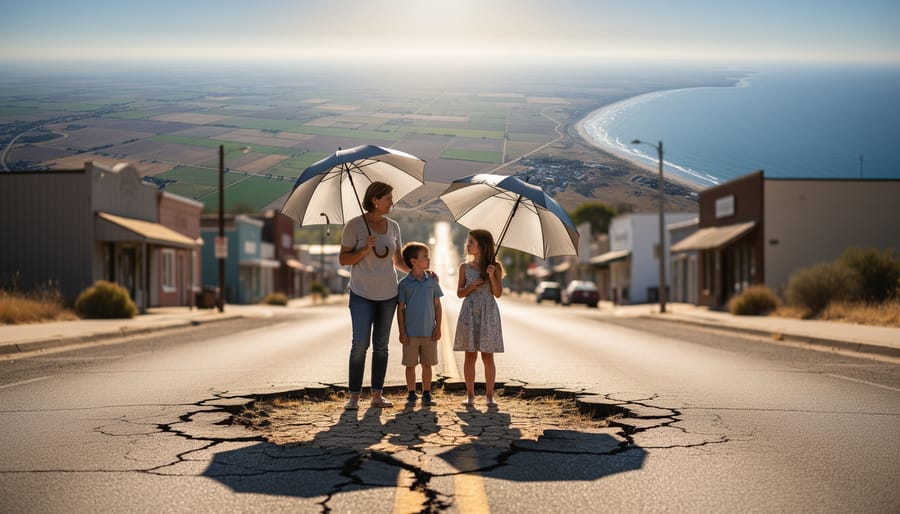
Climate change images are photographs, community snapshots, and scientific visuals that show how a warming planet is changing real places and real lives. Some searchers want to find them. Others want to understand what they’re looking at and why it matters. This article does both.
A single frame can do what a data table can’t. A satellite composite reveals the scale of change, while a photograph of a family in a drought-stricken town tells you what that change feels like. Together, they build a fuller picture than either could alone.
Right now, that picture is getting sharper. The National Press Club’s 26th annual photo exhibit opens today in Washington, DC, under the theme “Capture the Climate.” Meanwhile, Eyewitness: The Shadows of Climate Change, presented by the Pulitzer Center and Diversify Photo, follows communities in Southern California, Baja Sur, Mexico, and Cusco, Peru. Its three projects, supported by the Eyewitness Photojournalism Grant, explore erasure, injustice, and resilience through the eyes of photographers from historically underrepresented backgrounds.
Ahead, you’ll find the main types of climate imagery, how to read them critically, and where to see the work.
Why Pictures Matter in Climate Science Communication
A temperature record is precise, but it rarely stops anyone mid-scroll. A trend line showing a degree of warming over a century is accurate, and it is also easy to read as abstract. That gap between measurement and meaning is exactly where imagery does its work.
For readers still building a foundation on what climate change is pictures act as a bridge. Numbers describe how much the planet is changing. Images show where, and to whom. A satellite view of shrinking ice, a photograph of a flooded street, or a before-and-after comparison of a coastline turns a dataset into something a person can recognize and remember.
This is why researchers and communicators increasingly pair datasets with visual storytelling rather than treating them as separate tools. The data supplies the evidence, and the image supplies the context that helps people grasp why the evidence matters. Neither works as well alone. A striking photo without measurement can feel anecdotal, while a chart without a human frame can feel distant.
The current wave of climate photography reflects this thinking. Documentary projects such as Eyewitness: The Shadows of Climate Change, presented by the Pulitzer Center and Diversify Photo, explore resilience and injustice in climate-affected communities. Open-call efforts like the Your Shot community’s #MyClimateAction challenge invite everyday photographers to contribute their own perspectives. Both approaches broaden who gets to show what a changing climate looks like.
Science communication research suggests that people tend to engage more readily with issues they can picture. That doesn’t make images a substitute for data. It makes them a way in, an invitation to look closer at the evidence behind what the picture shows.
Three Kinds of Climate Change Images
Photojournalism from Affected Communities
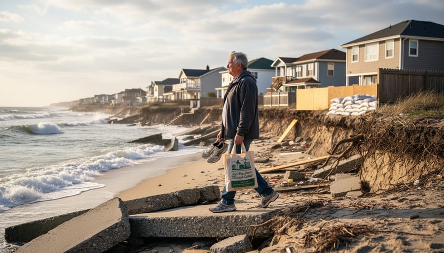
Some of the most powerful climate photography comes from people who live inside the story rather than visiting it. The exhibition Eyewitness: The Shadows of Climate Change, presented by Pulitzer Center and Diversify Photo, shows what that looks like in practice. It explores the intersections of erasure, injustice, and resilience as climate change advances, and it grounds those big ideas in specific places: climate-affected communities in Southern California, Baja Sur in Mexico, and Cusco in Peru.
Three featured projects make up the exhibition, each supported by the Eyewitness Photojournalism Grant. The grant backs visual storytelling by photojournalists from historically underrepresented backgrounds in the media. That detail matters. It means the people framing these stories often share a closer connection to the communities they document, which can broaden whose experiences reach a public audience.
Documentary work like this does something data alone can’t. It records how a warming world is felt day to day, in homes, neighborhoods, and livelihoods, while pointing to how people respond and adapt.
Community-Sourced Photography
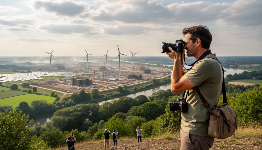
Not every climate photograph comes from a professional with a press pass. Citizen and amateur photographers add a layer that documentary work alone can’t: the view from a backyard, a neighborhood creek, a familiar stretch of coast. When the Your Shot community shared its best photos in response to the #MyClimateAction challenge, it showed how a simple prompt can turn everyday observation into a shared visual record.
What does this participatory model add? Mostly, local and ordinary detail. A person who walks the same trail every week notices small shifts that a visiting photographer might miss, and those images can reflect climate impacts on biosphere in places that rarely make headlines. They also invite action, since the challenge frames photography as something people do, not just something they view.
Community photos work best as a complement. Pair them with measured data and professional reporting, and they help make a global story feel personal.
Scientific and Observational Imagery
Not every climate image is meant to move you. Some are meant to be measured.
Researchers treat certain photographs as data. Satellite imagery lets scientists track changes in ice cover, vegetation, and coastlines across entire regions, and they can compare the same scene over many years using consistent methods. Repeat photography works on a smaller scale. A team returns to the exact spot where an earlier photo was taken, frames the shot the same way, and documents what has changed in a glacier’s edge or a shoreline. Time-lapse sequences add the dimension of time, turning slow change into something you can see in seconds.
What makes these images useful is that they can be quantified. Analysts can measure an area, a retreat distance, or a change in extent directly from the frame.
They also pair well with ground-level storytelling. A satellite view shows the scale of a change, while a documentary photograph shows what it means for the people living through it. Used together, the two give a fuller picture than either one alone.
Key Details on Current Climate Photography Exhibitions
Two efforts show how climate photography is being presented to the public right now. The National Press Club’s 26th annual photo exhibit opens in Washington, DC, under the theme “Capture the Climate.” Separately, Eyewitness: The Shadows of Climate Change, presented by the Pulitzer Center and Diversify Photo, explores the intersections of erasure, injustice, and resilience as climate change advances. It is rooted in climate-affected communities in Southern California, Baja Sur in Mexico, and Cusco in Peru.
| Exhibition or Initiative | Organizer or Presenter | Theme or Focus | Locations Covered |
|---|---|---|---|
| National Press Club photo exhibit (26th annual) | National Press Club | “Capture the Climate” | Washington, DC |
| Eyewitness: The Shadows of Climate Change | Pulitzer Center and Diversify Photo | Erasure, injustice, and resilience | Southern California; Baja Sur, Mexico; Cusco, Peru |
| #MyClimateAction challenge | Your Shot community | Community-shared photos responding to a climate prompt | Contributions from the Your Shot community |
The three Eyewitness projects were supported by the Eyewitness Photojournalism Grant, which backs visual storytelling by photojournalists from historically underrepresented backgrounds in the media. That detail matters because it widens who gets to document these changes and from what vantage point.
One practical note: exhibition dates are not confirmed here, so check with the organizers directly for current schedules before planning a visit. Images like these work best alongside the underlying evidence, and the scientific consensus on climate change gives you the measured context that photographs then make personal.
How to Read a Climate Image Critically
A striking photograph can feel like proof, but it’s better understood as a starting point. A few habits help you get more from every climate image you meet.
Start with the caption and credit. Who took the picture, when, and where? A good caption anchors an image in a real place and moment. Without one, it’s hard to know what you’re actually looking at.
Next, notice who is telling the story. Documentary projects like Eyewitness: The Shadows of Climate Change, presented by the Pulitzer Center and Diversify Photo, are backed by a grant that supports photojournalists from historically underrepresented backgrounds. That matters because the person behind the lens shapes what gets seen. Ask whose perspective is present and whose might be missing from the frame.
Then separate the moment from the trend. One image of a dry riverbed or a flooded street shows a single event. Climate patterns emerge across decades of measurement, so a photograph illustrates a claim rather than proves it. Pair what you see with the underlying data before drawing conclusions.
These habits pay off in practice. Students can learn to cite images responsibly, educators can build lessons that connect a photo to a dataset, and professionals can choose visuals that inform rather than overstate. Visual literacy turns a powerful picture into a more reliable way of understanding a changing planet.
Common Questions About Climate Change Images
Where can I find reliable climate photography?
Look to organizations that publish credits and captions with their work. Photojournalism programs such as the Pulitzer Center and Diversify Photo, which present the Eyewitness: The Shadows of Climate Change exhibition, are good examples, as are museum and press-club exhibits like the National Press Club’s “Capture the Climate” show in Washington, DC.
How do researchers and educators use climate images?
Researchers use satellite imagery and repeat photography as measurement tools, comparing the same place across time. Educators pair those images with datasets so students can connect numbers to what a changing landscape actually looks like.
Can anyone contribute climate photos?
Yes, in participatory communities. The Your Shot community, for instance, shared its best photos in response to the #MyClimateAction challenge, showing how everyday photographers add local perspective to the visual record.
How do I tell documentary work from illustration?
Check the caption and credit. Documentary photography names a photographer, place, and context, while illustration or stock imagery often stands in for an idea without tying it to a specific event.
A few practical habits make any of these answers more useful. Treat a single photograph as an illustration of a trend, not proof of it, and look for the long-term data behind the scene. It also helps to see how images fit into the wider conversation about responses, including mitigation and adaptation, since many documentary projects show communities doing both. For current exhibition schedules, check directly with the organizers, as dates are best confirmed at the source.
Climate change images do something a spreadsheet can’t: they connect measured data to human experience. A temperature trend tells us the planet is warming, and a photograph of a community adapting to that change helps us feel what the number means.
What’s encouraging is how many people now help tell these stories. The Eyewitness Photojournalism Grant supports photographers from historically underrepresented backgrounds, while communities like Your Shot invite everyday contributors to share their own view through challenges such as #MyClimateAction. Each perspective adds detail the others miss, and together they build a fuller picture than any single lens could.
So take the next step. Visit an exhibition, browse a visual archive, or look closely at the photos in your own neighborhood. The more of these stories we see, the better we understand a changing world, and the better prepared we are to respond to it.